Avalanche Canada
Helping backcountry users stay
informed, safe and prepared.
User Research
Mobile Design
Interaction Design
Project Overview
Avalanche Canada provides some of the most reliable safety forecasting in North America, but understanding the data is only half the battle. The Avalanche CAN mobile app offers technical avalanche reports and a manual slope safety evaluation tool. However, both assume a level of expertise that many skiers, snowboarders, and snowmobilers don’t have, especially those entering the backcountry for the first time.
Our team of six redesigned a key part of the experience to meet users where they are: not just with information, but with real-time, personalized support. We created an experience that paired intuitive activity-based education with a dynamic readiness questionnaire, all structured around building confidence and decision-making clarity.
Our goal became clear: create an experience that helps users not just access information, but confidently act on it, bridging the critical gap between knowledge and action.

My Role
As part of a six-person design team, I took the lead on research and played a key role in shaping the foundational strategy behind the product experience. I conducted heuristic evaluations of the existing Avalanche CAN app, facilitated user interviews with both experienced and novice backcountry skiers, and synthesized insights that informed our design direction.
I was also responsible for researching and organizing the content for the educational information cards, ensuring accuracy and accessibility across categories like snow safety, slope assessment, and gear preparedness. Additionally, I supported interaction design across the readiness questionnaire and the info card flows, collaborating closely with my team to ensure usability and clarity at every touchpoint.
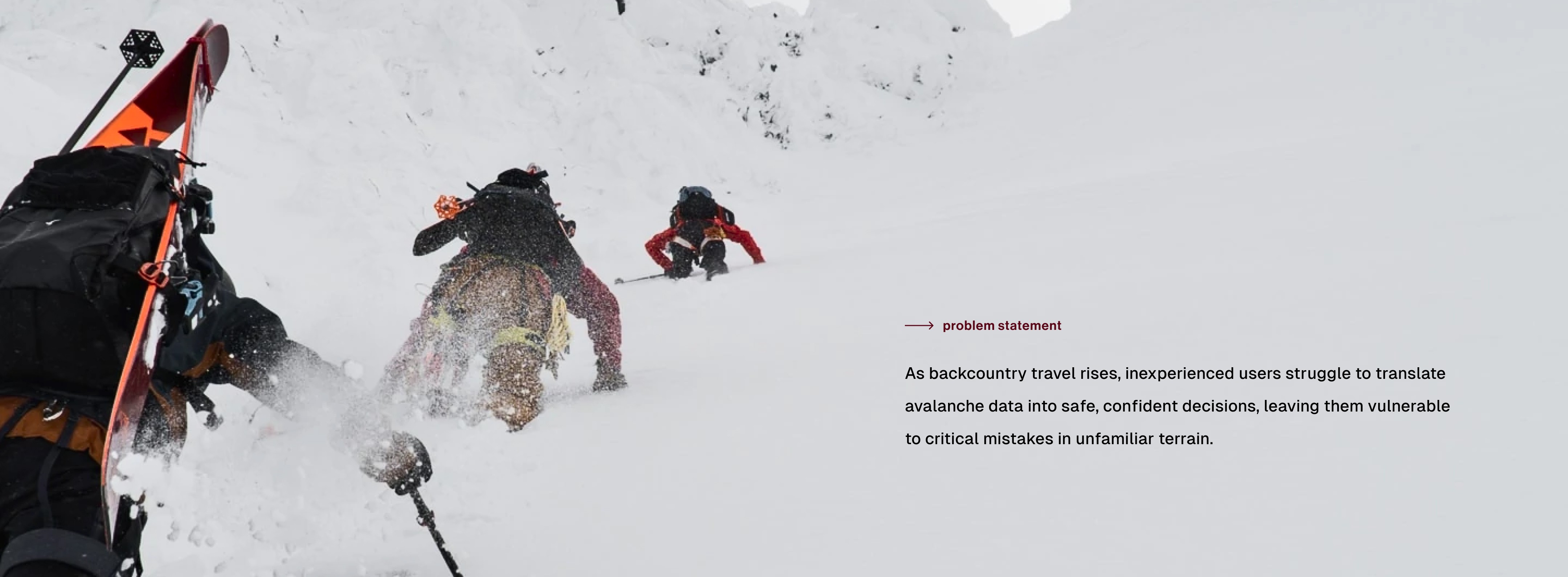
The Problem
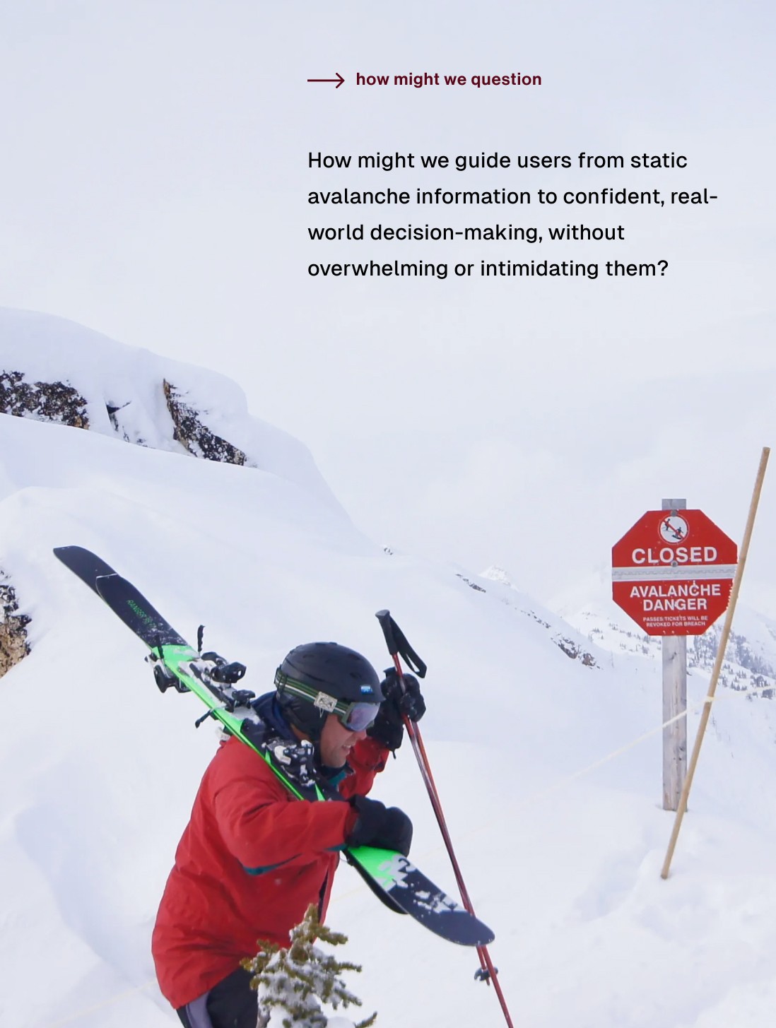
In the backcountry, every decision matters, and a wrong one can have serious consequences. Avalanche CAN aimed to keep users safe by providing avalanche forecasts and tools like the Avaluator, a manual slope evaluation chart. But even with these resources, our research revealed that users weren’t confident making decisions when it mattered most.
The Avaluator required users to interpret slope angles, analyze snow conditions, and manually assess terrain, skills that even seasoned skiers struggle with under pressure. For newcomers, it felt confusing, static, and intimidating. Instead of guiding action, the app often left users feeling overwhelmed. Worse, without confidence in the tools, users resorted to gut instincts, social media posts, or group consensus, relying on judgment rather than data.


Our interviews made it painfully clear: the culture around avalanche safety expected people to "just know," but real confidence didn’t come from having more data, it came from having the right kind of guidance. Users didn’t need more statistics; they needed help answering critical questions in the moment:
Is this slope safe for me today? Am I prepared to handle an emergency?
From a product lens, this revealed an urgent opportunity: how could we bridge the space between raw information and real-world action? How could we build a safety experience that wasn’t just smart, but human?
We recognized that while Avalanche CAN succeeded in delivering information, it wasn’t designed to support real-world action.
Research Approach
Our research approach combined a heuristic evaluation of the current Avalanche CAN app with qualitative interviews to surface gaps between information and real-world decision-making. We spoke with one highly experienced backcountry skier and two less experienced users to understand how different skill levels impacted app usability and avalanche safety decisions.
Our heuristic review focused on how accessible and actionable the app’s information felt when facing real-time terrain decisions. The interviews allowed us to capture personal stories, frustrations, and emotional barriers to safe behavior.


Key Insights
Through our research, three core insights shaped the design direction:
Difficulty translating avalanche forecasts into personal decisions
Users struggled to move from reading technical data to answering basic readiness questions like, “Am I prepared for this terrain today?”
Feeling overwhelmed by manual slope evaluations
The Avalator tool required judgment calls that newer users didn’t feel equipped to make. Confidence was low even when information was available.
Need for quick, actionable advice without technical jargon
Users wanted a way to bridge knowledge gaps without needing a background in snow science — simple, trusted guidance that could be followed in the field.

Our Solution
We proposed two interconnected features to bridge the knowledge-action gap:
A Readiness Questionnaire: A lightweight, intuitive flow that helps users assess their personal preparedness before heading out.
Quick Info Educational Cards: Categorized content modules that provide just-in-time education on snow science, slope assessment, gear preparation, and rescue basics.
These tools would work together to shift the app’s focus from passive information delivery to active decision empowerment.

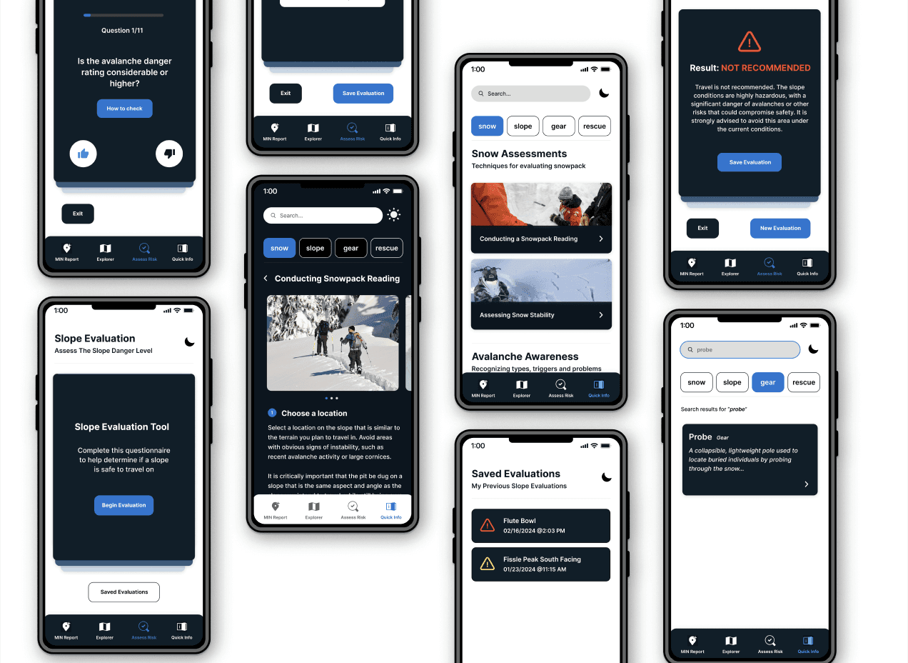
Readiness Questionnaire
The questionnaire asks users key safety questions across categories like gear, group planning, avalanche conditions, and terrain familiarity. Rather than forcing users to interpret complex forecasts, the flow simplifies the process into a series of visual, bite-sized prompts.
Upon completion, users are given a clear, action-oriented recommendation: Safe to Proceed, Use Extra Caution, or Not Recommended. This output mirrors the Avalator but simplifies it through user-centered, contextualized language.


Quick Info Cards
Recognizing that some decisions can't wait until the night before a trip, we also designed a modular educational system using Quick Info Cards. These cards are categorized into four areas:
Snow
Slope
Gear
Rescue
Each card focuses on a single actionable skill, like identifying slab conditions, conducting a Rutschblock test, or verifying transceiver functionality. Cards are skimmable and prioritized for relevance, offering just the essentials users need to act safely without overwhelming them with theory.


Design System & Visual Decisions
To ensure the Avalanche Canada app update was as usable and reliable as possible, our design decisions focused on clarity, accessibility, and speed.
We chose a high-contrast color system (white on deep blue) to maximize readability across extreme weather conditions, achieving a contrast ratio of 18.44, well above accessibility standards.
Typography was scaled deliberately: no body text below 30px, large 38px headings, and consistent bolding for faster scanability without fatigue.
For navigation, we prioritized larger tap targets and visual content cards to accommodate users wearing gloves or experiencing reduced touch sensitivity. Each card paired critical information with visuals, helping users better retain avalanche concepts in the field.
A search function was added to minimize cognitive load and make retrieval of key safety topics faster and more intuitive. Custom iconography for new features like “Quick Info” and “Assess Risk” ensured these additions felt cohesive within the existing app system, while updated questionnaire inputs made interactions quicker and easier under pressure.
Overall, every design decision was made to help users access, comprehend, and act on life-saving information, even in moments of urgency.


Final Outcome
The redesigned Avalanche CAN experience bridges the most dangerous usability gap: the one between knowing and acting. It empowers skiers, snowboarders, and snowmobilers of all skill levels to make faster, smarter decisions without needing technical avalanche expertise.
Our work repositions the app not just as a source of information, but as a trusted decision partner in high-risk environments.


Mobile Screens
Credits
Closing Thoughts
What made this project so impactful was that every decision we made had a direct tie to real-world behavior. We weren’t guessing. The outcome wasn’t hypothetical. We were shaping how someone might decide whether to ski, snowboard, or snowmobile in uncertain terrain, and that comes with a real sense of responsibility.
Designing for risk forced me to ask better questions and think more critically about how trust is built in UX. I learned how critical it is to guide without overwhelming, and how great design doesn’t shout, it supports. Being part of a large team allowed me to focus deeply on research and systems thinking.
I gained a better understanding of how to map qualitative insights into scalable product logic. It reminded me that great design doesn’t just inform, it guides, supports, and, when needed, says “maybe not today.”
Services
UX Research
UX/UI Design
Interaction Design
Content Strategy
Information Architecture
Human-Computer Interaction
Tools
Figma
YEAR
2024