Vancouver Startup Week
A local gateway to
global opportunity.
WEB DESIGN
Design systems
BRAND STRATEGY

Project Context
When Vancouver Startup Week (VSW) announced its 2025 collaboration with Web Summit, it marked a significant shift: the event was no longer just a local celebration of startups — it was becoming a platform to help local founders gain international visibility. But the website didn’t reflect that growth. The visual identity felt outdated, the navigation was confusing, and users were struggling to find key actions like how to sponsor, volunteer, or submit an event proposal.
My Role
I was brought on as Web Experience Lead to rethink the entire experience, not just visually, but structurally. The goal was to make the website modular, scalable, and focused on clear user actions, while aligning it to VSW’s new global narrative. We wanted the website to feel like a launchpad: professional enough for sponsors, welcoming for volunteers, and inspiring for first-time attendees.
Research & Insights
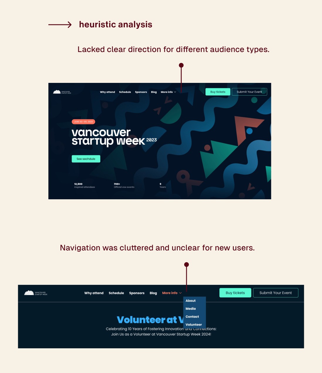
To kick off the redesign, I conducted a heuristic analysis of the existing VSW website to identify usability issues and areas for improvement. I evaluated the site against Jakob Nielsen’s 10 usability heuristics, focusing on clarity of navigation, consistency in UI patterns, and visibility of system status. The analysis revealed key friction points: CTAs were inconsistent, navigation lacked hierarchy, and users had no clear starting point based on their goals. These insights helped shape the foundational priorities for the redesign.
Defining the Challenge
One of the main takeaways from research was that users didn’t know where to begin. There were multiple audience types — sponsors, attendees, volunteers, and event hosts, and each had unique entry points.


Strategy & IA
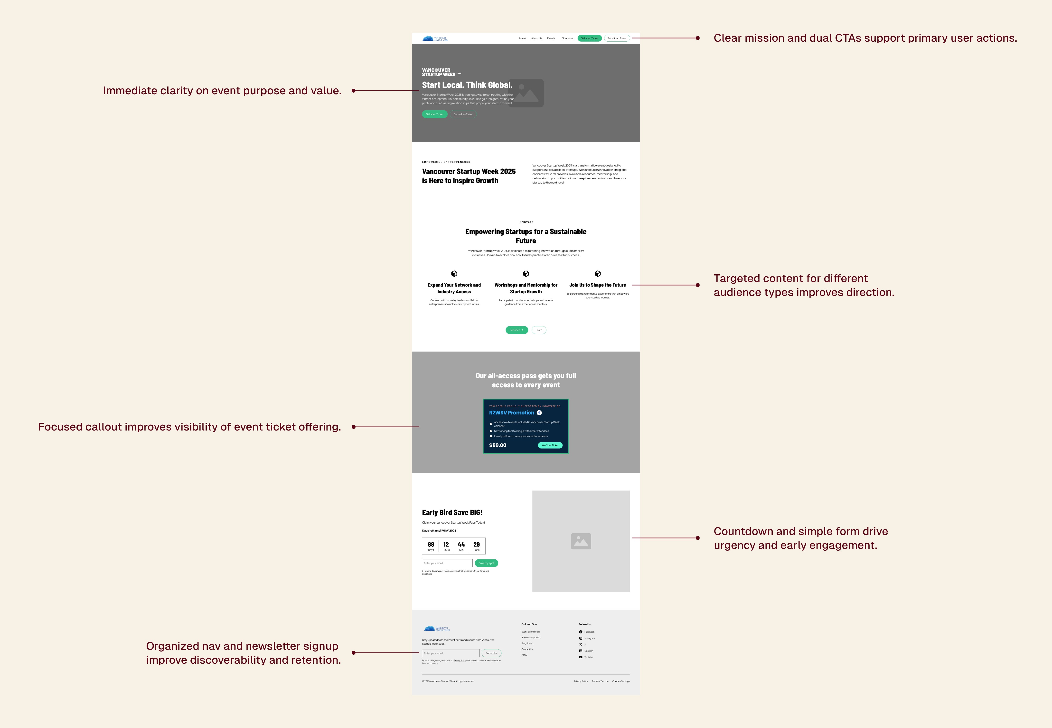
So I restructured the entire information architecture around five key touchpoints: Home, Sponsors, Blog, Contact, and Event Proposal. These became the foundation of a lightweight, content-first microsite that could scale in future years without a complete redesign.
Each page supports a core user journey —> no filler.

Wireframes & Layout
From there, I moved into wireframes. I prioritized modular sections, repeatable CTAs, and layout flexibility — knowing the internal team would need to reuse components in different contexts. I made heavy use of Figma’s Auto Layout to ensure every section was responsive and easy to duplicate or re-theme year-over-year.
Visual Design & System
Visually, I wanted to maintain the bold energy of VSW’s in-person events. I created a UI kit that balanced clarity and vibrancy, pairing Barlow Semi Condensed for headlines with Manrope for body text. Color palettes were high-contrast and lively, a subtle nod to the startup energy in the city. Buttons, cards, and typography styles were built as reusable components and documented clearly for developer handoff.
Throughout the process, I worked closely with the development team to ensure design specs were not just clean, but realistic. I organized my Figma files with named tokens, design specs, and layout rules. By the time we reached the handoff stage, the site was development-ready, responsive, and aligned with the scheduled launch date.
The feedback from the team was incredibly positive, they loved how much clearer and more engaging the site felt. In the first week of early access, ticket sales picked up noticeably, and there were fewer questions coming in about how to navigate or get involved with the event.
Reusable tokens and components enabled easy dev handoff and rebranding.
Results & Outcomes
This project reminded me of the power of small, intentional shifts, like rewriting a CTA to make it feel personal, or adding a modular layout that saves hours of dev time later. More than just a visual overhaul, this redesign gave VSW the structure it needed to scale its presence and grow its community.
This wasn’t just a redesign — it was a reframe of VSW’s mission.
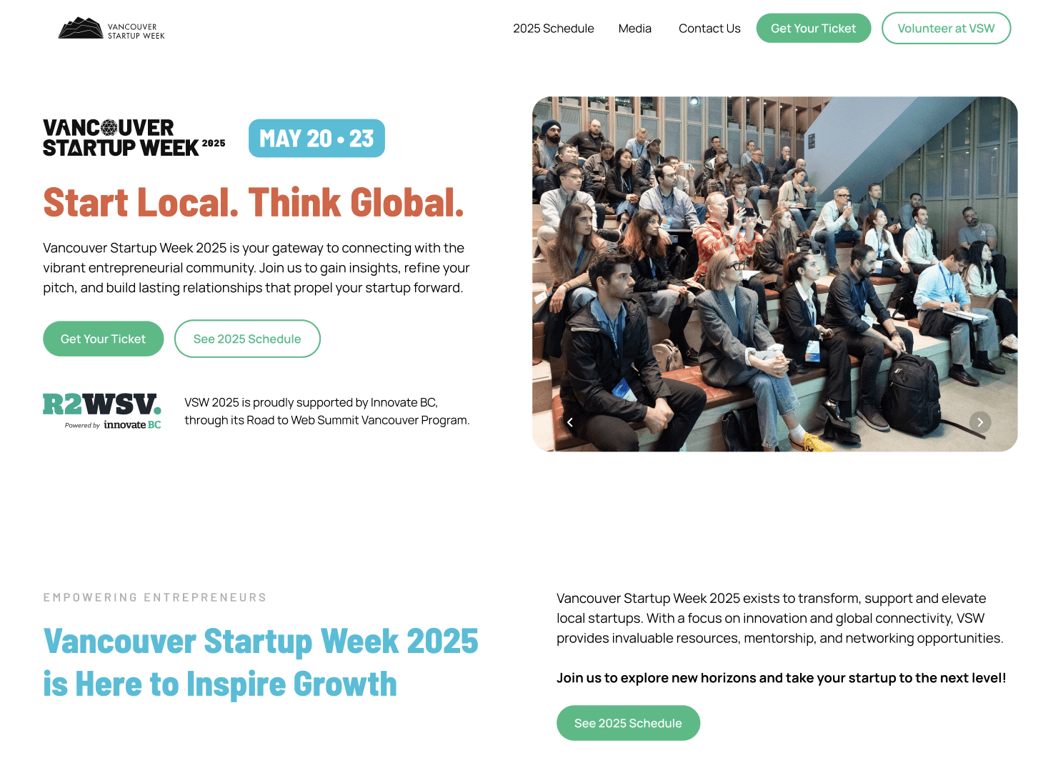

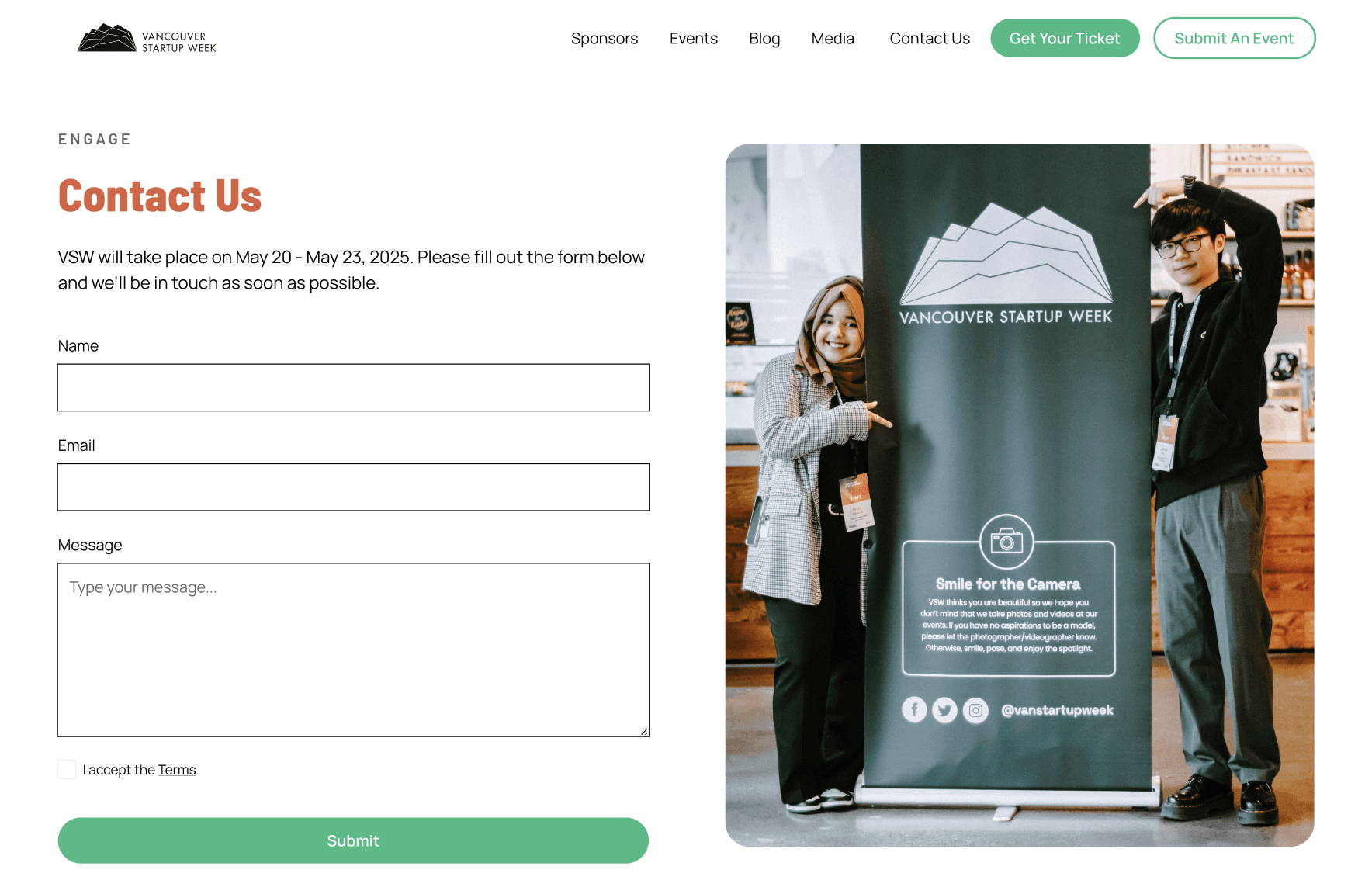
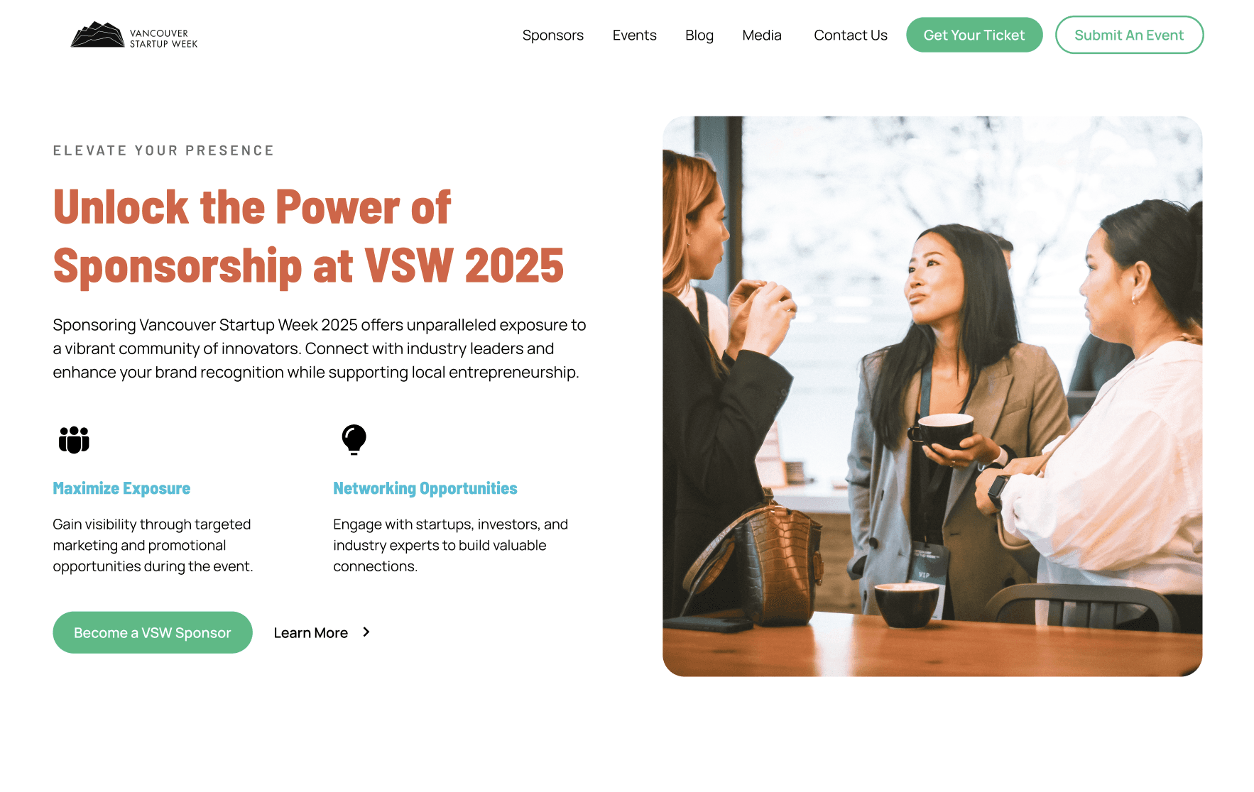
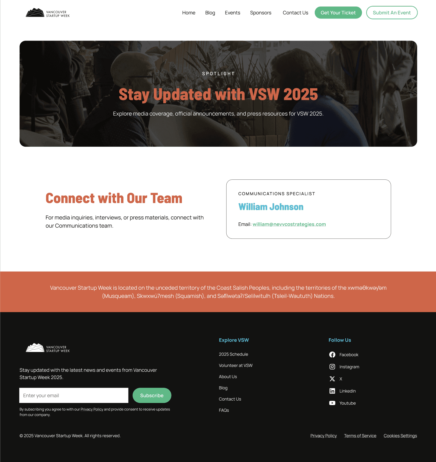
Web Screens
Credits
Closing Thoughts
This was one of my favourite projects to date, not just because of the challenge, but because it brought together so many pieces I love: community-driven storytelling, systems thinking, and designing for impact. The final site didn’t just look better, it worked better, for the people behind it and the people experiencing it.
Services
UX Strategy
UX/UI Design
Visual Design System
Design System Documentation
Information Architecture
Developer Handoff
Tools
Figma
Contrast Checker
Google Docs
Notion
Slack
YEAR
2025